How important is your Website´s Homepage for SEO?
April 29, 2024
Your Website´s Homepage is the most important part of your online presence because it is essentially the first thing visitors see when they land on your site. And you know what they say about first impressions…right? And beyond a first impression, your homepage encapsulates your brand vision, your essence and it guides your visitors through your world. Your Website´s homepage design and content should not just be good, but delicious. So yes, absolutely, for branding and conversion purposes, your website´s homepage is the most crucial element that will attract or repel your ideal client.
But for SEO and Google´s purposes, the homepage is also the most important page on your site! Why?
- Google uses your homepage as a starting point for crawling a website, to understand and find new pages inside your website.
- Google re-crawls your homepage often to see if there are new and updated pages on your website.
- Any pages linking from your homepage are important for Google. “In a well-organized website the major category pages and any other important pages are going to be linked from the homepage” (John Mueller, Google analyst). As you click away from the homepage, the pages become less critical.
- Let´s simplify: Homepage=the most important, One click away from homepage=second most important, two or three clicks away from home page= less important
Does that make sense? Do you understand now the importance of of the pages on your website? It basically does much of the heavy lifting for your business, especially if you do not have a blog.
Your Homepage design is key to standing out and compelling your visitors to take action. It is your storefront window, but how can you make sure your homepage captures the heart of your visitors?
When I designed my first website as a photographer, years ago, I just put together a logo, my best photos, and some text, and that was it as far as web design. But your home page is so much more than that, it is your hub, it is a little sprinkle of everything that encapsulates everything you do in your business, your vision, and who you are.
Your homepage should include everything that you can do for your clients, including newsletter signups, offers, links to valuable resources such as podcasts, blog posts, shop, and more. Most visitors that land on your homepage do not know you yet, and they need to learn about who you are, you want to encourage your visitors to go deeper. You need to take your visitors on a journey, imagine you take your visitors down a path that will create an experience for people. Make it eye-catching for people and easy for them to jump from one place to another.
If you are struggling to get your website indexed, it might be that your homepage does not have enough content. Having said that, let me give you my expert tips on how to convert visitors into buyers!
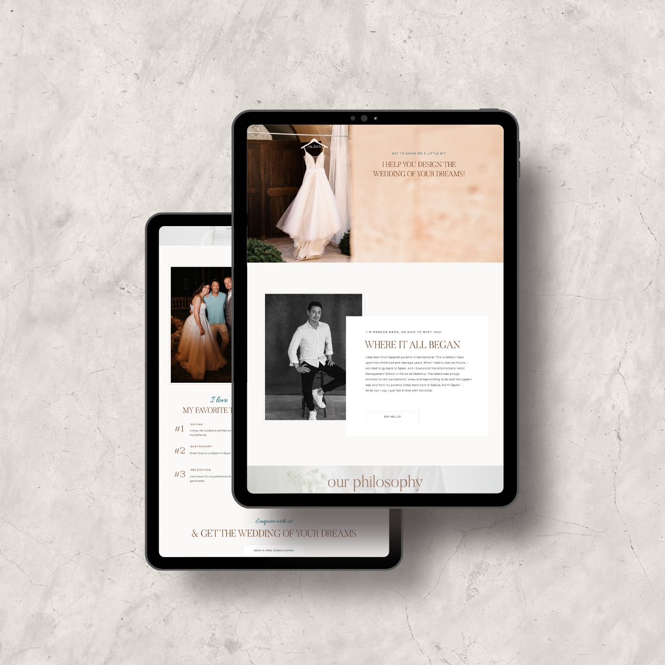
7 Design Tips to ensure your homepage is making a first impression that leads to higher conversions.
01. WHAT DO YOU DO AND WHO IS IT FOR?
Within a few seconds of your visitors landing on your homepage, they should be able to tell who you are, what you do, and who you are for.
The Home page is where you will introduce your readers to your services and your personality. You will want to get them excited about working with you (“know/like and trust”)
For example, if you are a wedding planner based in Barcelona, your copy on the Hero section of your homepage could read:
- “By Olivetti, Luxury Wedding Planners – Experts in Joyful Celebrations, We work with stylish couples across the UK and Europe”
If you work locally, make sure to include the location where you are.
Regarding copy, it´s simple, use clear headlines that don´t beat around the bush, located above the fold line (what we call the Hero section). The Hero section is the part of the Homepage that you can see as you land, without having to scroll down. There is no need to add anything else on the top of the Hero section, that is all, together with a couple of professional photos. Clear headlines will also help with SEO and rank your homepage for primary keywords.
For SEO purposes, remember to use keywords in your headlines, especially your first headline which should be tagged H1. Do not forget the SEO title for your website and meta description.
02. COMMUNICATE YOUR UNIQUE VALUE PROPOSITION.
Before even starting any website design, you need to figure out -and this will be part of your marketing plan- what your unique value proposition is and what makes you different from your competitors. This is the single more important element you need to emphasize throughout your website (not only on your homepage). This is who you are and what makes you unique and helps you attract your ideal client. Your unique value proposition could be a tagline or a few sentences.
Your visitor wants to know that you can help them – add some copy that explains how you can help them ie. “I work with ________ to help them ___________”
What makes you unique? How can you fix their problem better than anyone else?
After starting your Hero section with a clear headline announcing what you do and who you serve (see wedding planner example), then show your client how you can relate to their needs, and how you are the best person to solve those needs. If you are warm and funny, incorporate your own voice into your website copy. The tone of the text on your website should reflect your brand personality.
Talk about a problem that your ideal client has and address how your product or service helps. This is just a concise one-liner for now. We will tell them more on the Services or product pages.
03. NAVIGATION
What is the primary action you would like your reader to take on your site? Feature a Call to Action to encourage them to take this action. This could be joining your email list, viewing your portfolio, reading the blog, making a calendar appointment with you, joining a Facebook group and so on. Also make sure your navigation menu is visible and simple. You should include in the menu the most important pages you want visitors to go to (About, Services, Gallery, Shop, Blog, Contact, etc) but it is not necessary to list all of your pages here.
Make sure you have a mobile version of your website that is responsive, easy to navigate, and with a mobile menu.

04. SHOW SOCIAL PROOF
How do your visitors know that they can trust you and that you know what you are talking about? Including 1 – 3 testimonials on the Home page is an option to display your expertise. Do not make the mistake of putting all of your testimonials on a separate section of your website. They need to be sprinkled in between sections of your homepage, especially before your offer.
If you have appeared in publications or have reputable brands that you have helped, then including “as seen in” logos on the Home page would be beneficial as well. It is also helpful to include a photo of your client to go with the testimonial, or you could even add screenshots of texts or emails you have received. If you have been featured on magazines or blogs, also add their logos. If you do not have testimonials yet, you can use other vendors in your industry or do a beta testing of your product or service.
05. SHOW YOUR PROCESS
After stating who you are, what you do, who you serve, and showing some social proof, outline your process or offerings (you may include a video, a list or a table). Make your offerings clear and do not offer too many things or you will confuse your clients. Highlight the fact that working with you will solve your client´s problems, and that the experience itself is easy and stress-free.
One of the goals of showing your process is for visitors to get to know you better and to connect with them. Be authentic and genuine.

06. USE A LEAD-MAGNET
A lead-magnet is an incentive you provide in exchange for an email. As you know social media is very powerful but sadly, you do not own your social accounts, so it makes sense for us to build a system where we can capture our visitors’ emails. Building an email list for your business might be the single most important thing you do as a marketing tool. Usually, the bigger the list, the more you sell. Imagine not having to rely on social media every time you want to promote an offer.
Do not try to get people to subscribe to your list without giving something valuable in return. You need to provide an irresistible lead-magnet (a pdf, checklist, video, preset, ebook..etc). It´s a good idea to use a lead-magnet to solve your client´s problems. For example, if you are a wedding planner in the UK, you could give a pdf with “3 Tips for finding your perfect wedding venue” or “The ultimate guide to stress-free wedding planning”.
These “freebies” are integrated in your website via an email marketing platform. The most popular ones are MailChimp, ConvertKit, MailerLite or FloDesk.
07. USE HIGH-QUALITY PHOTOS & VIDEOS.
This is a favorite topic for me as I am also a photographer. Use good quality Photography throughout your site, but especially on your homepage. This is where your best photos or work should be displayed. Make sure the photos are on brand, high-quality, focused, with nice colors, properly exposed and show off your best work.
Show only what you want to sell. Curate as much as possible. A beautiful video on your hero spot on your homepage can elevate your website to a luxury level. Adding movement will also add a different dimension and will keep visitors engaged.
Remember that visitors want to see who is behind your brand, so weave a couple of beautiful (professional) photos of you and your team throughout the homepage. If you have not had a brand photoshoot yet, we can help if you live in Mallorca! Contact us on hello@atelierwebphoto.com for a consultation.
There are also great stock photo sites for your website, I will make a blog post giving you my recommendations later on but some very popular stock photos sites are: Elevae Visuals (my favorite), Pexels, Unsplash, Lummi.ai, Pixabay, Styled Stock Society.
In conclusion, having the perfect homepage is easy, it will help you attract your ideal client and help search engines find you and rank higher. It is worth taking the time and investing in a well-designed website, so that your website can do the heavy lifting for you. Here you have a checklist that can help you make sure you stay on track!
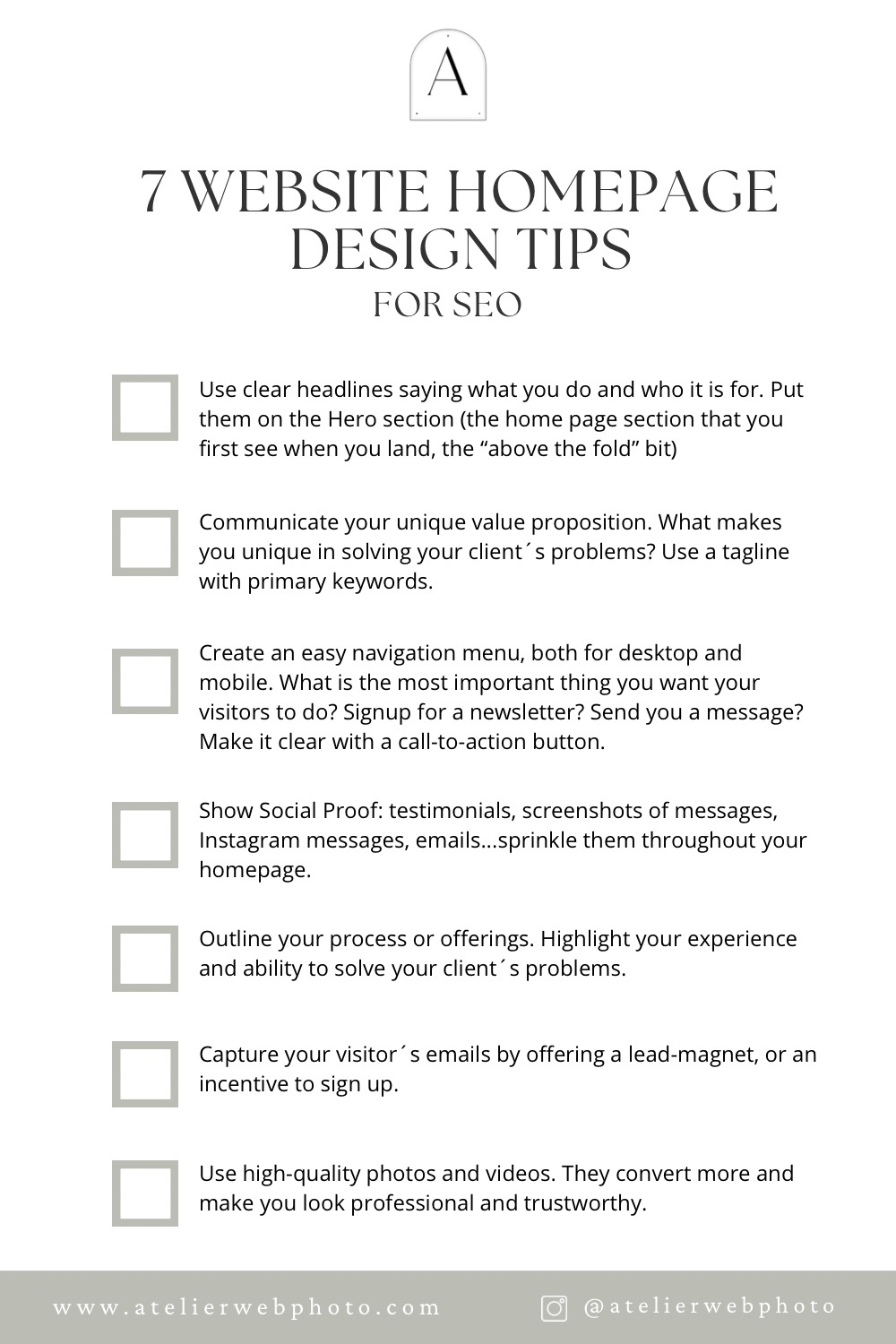
If you enjoyed my tips to help you optimize your website´s homepage design, be sure to check out my post photos
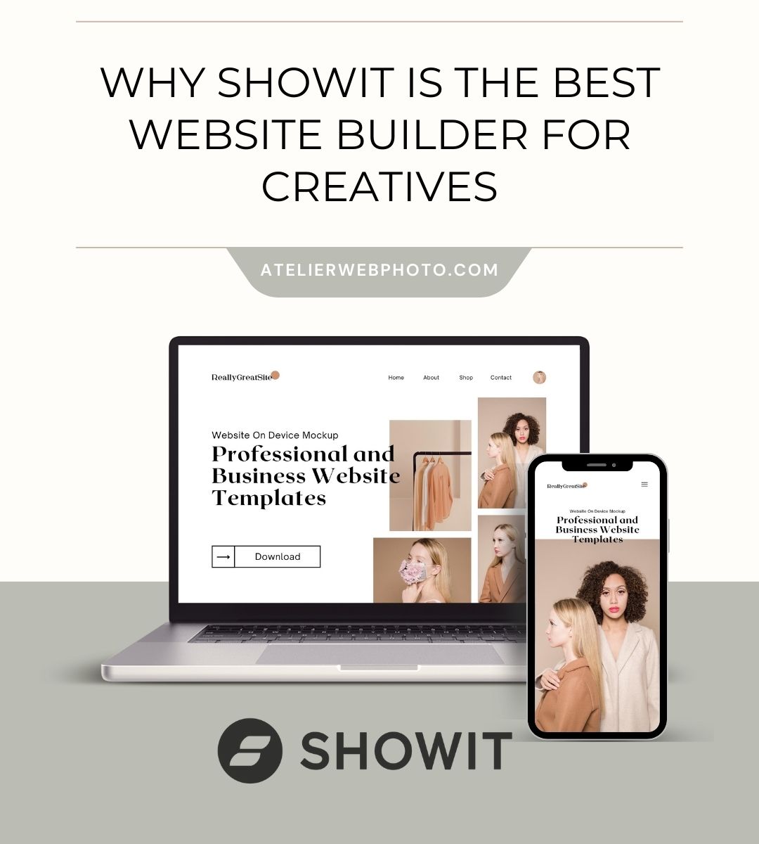
and if you are considering improving your current Showit website or building a brand new one, I´d love to chat!
No te pierdas lo último del BLOG
Fotógrafa, diseñadora web, soñadora y curiosa, a partes iguales - así como mamá ajetreada, ávida consumidora de todo tipo de cursos online, aficionada al yoga y al pádel, amante de la playa y de descubrir cosas nuevas...y mucho más.
En mi blog te ayudo a conseguir mejores bodas para que puedas tener la vida que realmente te mereces.
Hola, soy Sandra
¿No sabes qué falla en tu negocio de Fotografía de Bodas? ¿Cansada de trabajar sin resultados?
Hazlo en 3 minutos
HOME
Copyright by Atelier WebPhoto
powered by Showit
ABOUT
WEBSITE DESIGN
shop
BLOG
CONTACT
Email us:
hello@atelierwebphoto.com
Aviso Legal - Legal Notice
Showit Website Design in Mallorca for Photographers, Wedding Professionals, Creatives and Small Businesses.
Marketing Resources, Templates and Guides.
Formación para Fotógrafas de Boda, Coach de Fotógrafas, y Diseño Web.
