How to select the right photos for your website
March 29, 2023
Leaning how to select the right photos for your website is crucial to help you attract your ideal client. If you want to sell more, your online portfolio or website needs professional looking photos. You know what they say, your products or services are only as good as the images you use to showcase them. It is scientifically proven that the better the photos on your website, the more you will sell. Show only the best of the best!
Be intentional with your photos. It is a good idea to invest some time into carefully selecting the images you want to represent you. Make sure your photos look professional above all. Photos that look outdated, with poor lighting and a lack of sharpness will not help you elevate your brand. If you do not have the budget to hire a professional photographer, watch free courses such as this really good one from Christina Greeve (no affiliation with her, or affiliate link) to learn how to take good photos on your own.
There are 4 main points we would like you to consider when choosing photos for your website:
1. VIBE AND OVERALL FEEL OF YOUR BRAND.
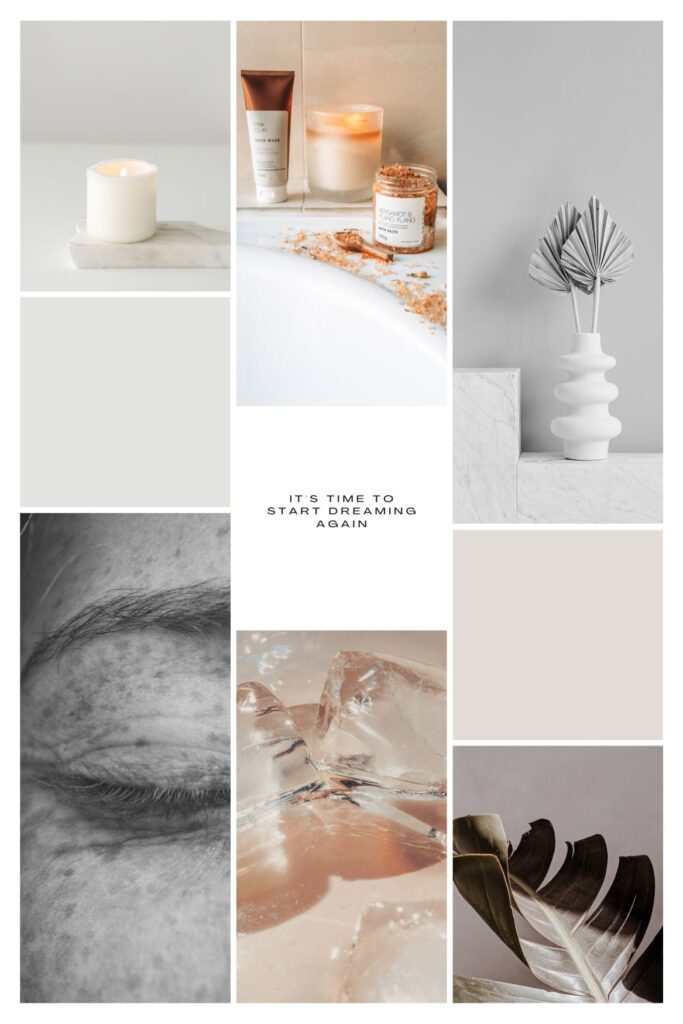
What emotions do you wish to give with your images? What do you want your client to feel that will make your service or product more appealing? For example, a luxury organic cosmetic brand should aim to evoke feelings of indulgence, luxury, and well-being in its clients. The brand should make customers feel special and pampered, as if they are treating themselves to a luxurious and exclusive experience. The use of organic and natural ingredients can also convey a sense of purity, health, and eco-friendliness, which can make customers feel good about themselves and their choices.
Additionally, the brand should strive to provide excellent customer service, personalized attention, and a seamless shopping experience. This can help customers feel valued and cared for, enhancing their overall satisfaction with the brand. Ultimately, a luxury organic cosmetic brand should aim to make customers feel beautiful, confident, and empowered, both through the quality of its products and the experience it provides.
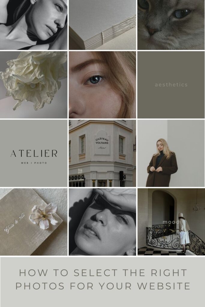
For example, the moodboard below mixes different images that evoke well-being, relaxation and luxury. We would use minimalistic photos, with few colours and organic textures and colours.
2. COLOURS AND TEXTURES.
Give your brand and website look cohesion by using only a limited colour palette. Two or three colours maximum.
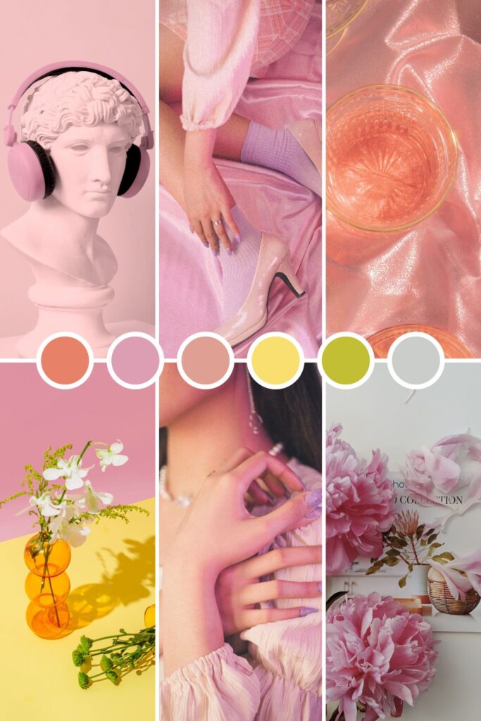
Pastel, bold, warm, cold, dark… colors can evoke different feelings. Make sure you use photos with predominant colors that match the feelings your brand, product or service want to give. If your brand is calm and serene then your colors will be more muted and organic. For an elegant, sophisticated look you would use darker colours, greys, blacks, dark green, mixed with textures that evoke luxury like marble, gold or velvet. Brighter colours are used for fun, vibrant, energetic moThese will be your brand colours. Warm colours are good for cozy, welcoming, organic feelings and cold colours are perfect for modern, cool, winter themes. Certain colours are proved to work better with certain types of businesses. For example, green is used for environmental, organic, healthy, calming feelings. Blue is used as a meaning for professionalism, security, formality. Red is used for passion, excitement and love, and so on. Check out this article if you want to learn more about how to pick the right colours for your brand.
If we were selling to a young casual audience, we could use fun vibrant colors that pop. See the moodboard below made in Canva. This set of images gives a completely different feel, a young, fresh vibe that stands out just by the use of colours.
Use textures to complement the photos and help you evoke the feelings you are looking for.
From ultra-modern tech to warm cozy and in-between. Always use colours and textures that represent what your client wants to have and feel. Mix plain colours or surfaces with textured ones and patterns.
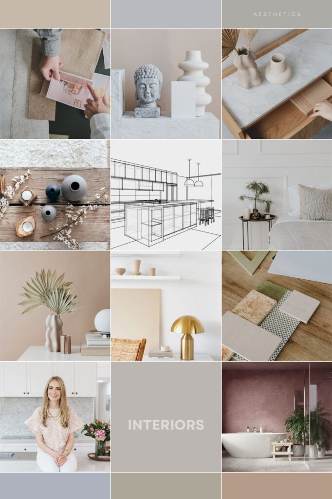
See our example below of an Interior Design brand. The colour palette is cohesive, in warm, organic tones and textures like stone, marble and wood.
3. RELEVANT CONTENT.
Choose images that show your products or services in action, or showcase their unique features.
Photos that show the behind-the-scenes, the quality of the materials or ingredients, the process of making a product or delivering a service are great relevant photos you can use. Always use photos that have something interesting for your audience.
- Use a mix of images: Variety is key when it comes to curating your photos. Use a mix of product shots, lifestyle photos, and candid shots to create a diverse range of images that capture your brand’s essence.
- Consider the layout: When curating your photos, consider how they will be displayed on your website. Will they be part of a grid or slideshow? Will they be full-width or displayed in a smaller size? Choose images that will work well with your website’s layout.
- Make good use of photos with negative space. This means leaving some space in the image empty or with a plain background. These images will help you give more attention to the message you are trying to say and will help your website look less cluttered.
Do not overload your website with the same type of images.
For example, if you sell Wedding Photography, do not use only photos of couples kissing. Include photos of the atmosphere, locations, details, jewelry, flowers, your gear, and so on. Use wide angle views and mix them with close-ups.
If you are the “face” of your brand, make sure you also use a variety of photos with you on them.
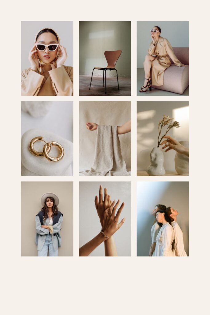
Your audience wants to know who you are and it will help you build trust in your brand. Use professional images as much as possible. If you take your photos with your phone, get a good phone and make sure the images are well-lit. Here is an example of a jewelry designer that mixes her images with styled stock photos and images from her photoshoot with a model.
4. KEEP IT CONSISTENT.
Consistency is key when it comes to selecting your photos. Choose a style and stick to it.
This could be a particular color scheme, filter, or aesthetic. By keeping your images consistent, you’ll create a cohesive look for your website.
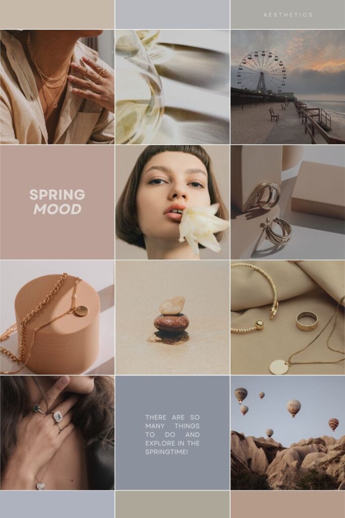
Here are some more tips to help you learn to select the right photos for your website:
- Start by selecting the best photos that you already have: Your website represents your brand, so it’s important to use high-quality photos that reflect the quality of your products or services. Choose images that are clear, well-lit, and have good resolution. Go through your collection of photos and select the best ones that showcase your skills, creativity, behind-the-scenes, your process, product, or service. Having a smaller selection of high-quality photos is better than a large collection of mediocre ones. If you feel there are gaps or something missing in your images, you could have a photo session to produce only those ones that are missing.
- Consider the purpose of your website and your ideal client: Think about the purpose of your website and the message you want to convey to your audience. Are you showcasing what your ideal client wants to see? Think of the vibe your clients want to feel, the colours they like, and the type of images that resonate with them.
- Choose a cohesive theme: A cohesive theme helps to tie all your photos together and creates a consistent look and feel on your website. Make sure the photos you select for your website match the overall style, tone, vibe, and colours of your brand. You can choose a theme based on color, subject matter, or style. Again, think of what your client loves to see.
- Use Styled Stock: If you want ready-to-use beautiful images then we recommend you subscribe to styled stock photos. These will save you lots of time trying to produce and edit your own. You usually pick a theme, a vibe or a colour and the platform will give you tons of pretty images. These photos are optimized for the web so you do not have to. I love SocialSquares, they have free resources too!
- Optimize your photos for the web: Large file sizes can slow down your website’s loading time, which can lead to a poor user experience. Optimize your photos by reducing their file size without compromising their quality. Make sure your photos are at 72 ppi resolution. The longest size can be 1800 pixels, or 2500 pixels long if the photo is on a header. You can use free online tools like IloveIMG or software like Adobe Photoshop to do this. JPEGs are best for photographs, while PNGs are better for graphics and logos.
- Organize your photos: Once you have selected your best photos, organize them into categories or albums. This makes it easier for your audience to navigate your website and find the photos they are interested in.
- Be mindful of copyright: When curating your photos, make sure you have permission to use them.
- Test your website: Before publishing your website, test it on different devices and browsers to ensure that your photos are displayed correctly and that your website’s loading time is optimal.
By following these steps, you can select the best photos and create a professional and visually appealing website or portfolio.
Photographer, website designer, dreamer in equal parts - busy mum and wife, spiritual student, yoga and paddle tennis lover.
I adore visually attractive brands with a unique personality and strong values. Showing yours to the world will help you sell your products and services better because your ideal client will resonate with you.
Show your clients your soul and why you do what you do best. My mission is to help you connect with your client and get them excited about your business.
HI, I´M SANDRA
FOLLOW US ON INSTAGRAM
@ATELIERWEBphoto
Subscribe to our
NEWSLETTER
Signup for news and to receive our PDF
Thank you!
You have successfully joined our subscriber list.
HOME
Copyright by Atelier Web
powered by Showit
ABOUT
WEBSITE DESIGN
SHOP
BLOG
CONTACT
Email us:
hello@atelierwebphoto.com
Aviso Legal - Legal Notice
Showit Website Design in Mallorca for Photographers, Wedding Professionals, Creatives and Small Businesses.
Marketing Resources, Templates and Guides.
